In this article, we will make a simple accordion in react. Accordion is useful when we need to create some application users interactively. Basically, we will create a bunch of questions and if we click on the question, then the div will expand and show us the answer.
So this is going to be a very fun project to do and as a beginner, it will teach us more because we will use some additional packages like styled components. Also, we will make this accordion very dynamic we can add question and answer in certain components and all effects will be reflected over the application. So let’s make it step-by-step.
Pre-requisite to Make Accordion in React
- Basic knowledge of ReactJS.
- Basic knowledge of React hooks.
- Basic knowledge of React props.
- Good knowledge of React Components.
Setting Up Project
Now firstly, we need to add two packages: (1) styled-components and (2) react-icons.
Then we need some basic components like Accordion.js, where we will add the main logic of the application. And the Data.js component, where we will add questions and answers. We have to modify the App component, we imported Accordion, and we just called Accordion in the return statement.
import './App.css';
import Accordion from './Components/Accordion';

function App() {
  return <Accordion />;
}

export default App;
Adding Data in Component
Now, before adding the main logic, we will add our data like question and answer in the Data component. We have added only three data and more data can be added which will reflect over the application.
export const Data = [
  {
    question: 'What do you call a dog magician?',
    answer: 'A labracadabrador.'
  },
  {
    question: 'What do you call a funny mountain?',
    answer: 'Hill-arious.'
  },
  {
    question: 'What did the astronaut say when he crashed into the moon?',
    answer: 'I Apollo-gize.'
  }
];
Importing Required Components
Now let’s move on to our main component, which is Accordion.js. Here we have imported our Data component to access the questions and answers from it. Then we imported styled-components to do styling and basic CSS, with this we don’t need to add CSS in any other file. Then, we imported react-icons to get access to icons like + and -, which will be useful in the accordion list.
import React, { useState } from 'react';
import { Data } from './Data';
import styled from 'styled-components';
import { IconContext } from 'react-icons';
import { FiPlus, FiMinus } from 'react-icons/fi';
Fetching Data From Data.js
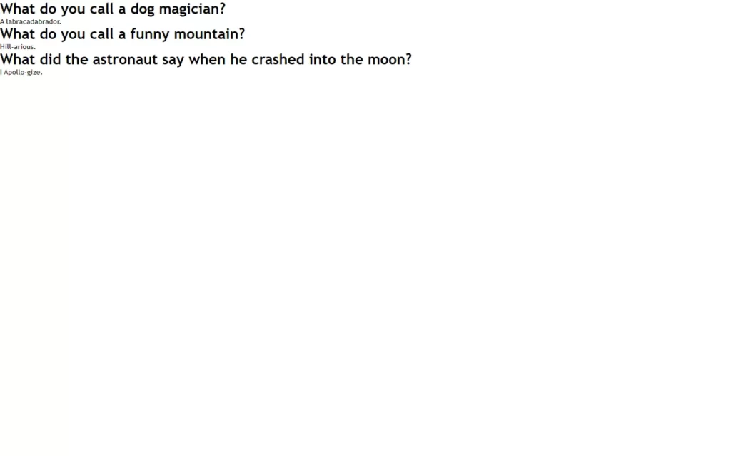
Now let’s move to the return statement, here we used this Data.map() method to fetch every data. Then we have added the <Wrap> component which is actually created with a styled component, to which we will add some CSS. Here we have added a heading tag where we have fetched questions for every data. Then we added answers in a paragraph.
const AccordionSection = styled.div`

`;

const Container = styled.div`

`;

const Wrap = styled.div`

`;

return (
    <IconContext.Provider value={{ color: '#00FFB9', size: '25px' }}>
      <AccordionSection>
        <Container>
          {Data.map((item, index) => {
            return (
              <>
                <Wrap >
                  <h1>{item.question}</h1>

                </Wrap>
                <p>{item.answer}</p>
              </>
            );
          })}
        </Container>
      </AccordionSection>
    </IconContext.Provider>
  );
};
Styling The Component
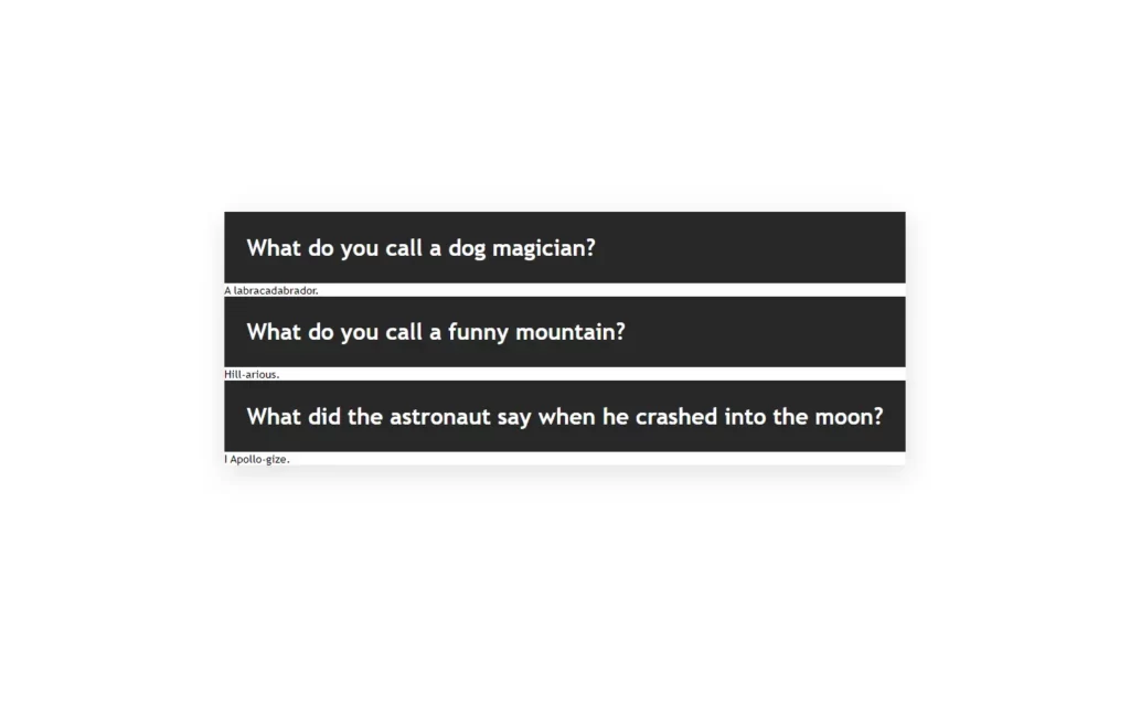
Okay, we have fetched our data successfully, and now we will add a little CSS in styled-components. Here we added common CSS as always, which you can simply modify to get your favorite effects. So here we did not do any special it’s like common CSS, so will move on to another part of the logic.
const AccordionSection = styled.div`
  display: flex;
  flex-direction: column;
  align-items: center;
  justify-content: center;
  position: relative;
  height: 100vh;
  background: #fff;
`;

const Container = styled.div`
  position: absolute;
  top: 30%;
  box-shadow: 2px 10px 35px 1px rgba(153, 153, 153, 0.3);
`;

const Wrap = styled.div`
  background: #272727;
  color: #fff;
  display: flex;
  justify-content: space-between;
  align-items: center;
  width: 100%;
  text-align: center;
  cursor: pointer;

  h1 {
    padding: 2rem;
    font-size: 2rem;
  }

  span {
    margin-right: 1.5rem;
  }
`;

const Dropdown = styled.div`
  background: #1c1c1c;
  color: #00ffb9;
  width: 100%;
  height: 100px;
  display: flex;
  flex-direction: column;
  justify-content: center;
  align-items: center;
  border-bottom: 1px solid #00ffb9;
  border-top: 1px solid #00ffb9;

  p {
    font-size: 2rem;
  }
`;
Finishing up Application
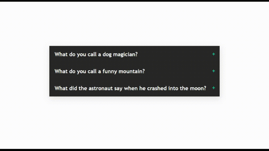
Our question div is looking a little good, but now we need to hide the answer and show it on a condition basis. For that, we have added a state named clicked with default false value. As we have a question in our Wrap component, we will add a click event where we will call the toggle function.
In this function, we have to check if an index is equal to clicked which means the question is already active then we just need to close it by updating the clicked value with null. Otherwise, we will update the clicked value with the index value.
Also, we added a span in the Wrap component, where if clicked is equal to the index then we will just put the minus icon, and we will replace the icon with a plus icon. Now for an answer, we will put the answer in a Dropdown component which will be visible if clicked is equal to the index value. Otherwise, we won’t show an answer.
const [clicked, setClicked] = useState(false);

  const toggle = index => {
    if (clicked === index) {
      //if clicked question is already active, then close it
      return setClicked(null);
    }

    setClicked(index);
  };

  return (
    <IconContext.Provider value={{ color: '#00FFB9', size: '25px' }}>
      <AccordionSection>
        <Container>
          {Data.map((item, index) => {
            return (
              <>
                <Wrap onClick={() => toggle(index)} key={index}>
                  <h1>{item.question}</h1>
                  <span>{clicked === index ? <FiMinus /> : <FiPlus />}</span>
                </Wrap>
                {clicked === index ? (
                  <Dropdown>
                    <p>{item.answer}</p>
                  </Dropdown>
                ) : null}
              </>
            );
          })}
        </Container>
      </AccordionSection>
    </IconContext.Provider>
  );
};

export default Accordion;

Full Source Code To Make Accordion in React
App.js
import './App.css';
import Accordion from './Components/Accordion';

function App() {
  return <Accordion />;
}

export default App;
Accordion.js
import React, { useState } from 'react';
import { Data } from './Data';
import styled from 'styled-components';
import { IconContext } from 'react-icons';
import { FiPlus, FiMinus } from 'react-icons/fi';

const AccordionSection = styled.div`
  display: flex;
  flex-direction: column;
  align-items: center;
  justify-content: center;
  position: relative;
  height: 100vh;
  background: #fff;
`;

const Container = styled.div`
  position: absolute;
  top: 30%;
  box-shadow: 2px 10px 35px 1px rgba(153, 153, 153, 0.3);
`;

const Wrap = styled.div`
  background: #272727;
  color: #fff;
  display: flex;
  justify-content: space-between;
  align-items: center;
  width: 100%;
  text-align: center;
  cursor: pointer;

  h1 {
    padding: 2rem;
    font-size: 2rem;
  }

  span {
    margin-right: 1.5rem;
  }
`;

const Dropdown = styled.div`
  background: #1c1c1c;
  color: #00ffb9;
  width: 100%;
  height: 100px;
  display: flex;
  flex-direction: column;
  justify-content: center;
  align-items: center;
  border-bottom: 1px solid #00ffb9;
  border-top: 1px solid #00ffb9;

  p {
    font-size: 2rem;
  }
`;

const Accordion = () => {
  const [clicked, setClicked] = useState(false);

  const toggle = index => {
    if (clicked === index) {
      //if clicked question is already active, then close it
      return setClicked(null);
    }

    setClicked(index);
  };

  return (
    <IconContext.Provider value={{ color: '#00FFB9', size: '25px' }}>
      <AccordionSection>
        <Container>
          {Data.map((item, index) => {
            return (
              <>
                <Wrap onClick={() => toggle(index)} key={index}>
                  <h1>{item.question}</h1>
                  <span>{clicked === index ? <FiMinus /> : <FiPlus />}</span>
                </Wrap>
                {clicked === index ? (
                  <Dropdown>
                    <p>{item.answer}</p>
                  </Dropdown>
                ) : null}
              </>
            );
          })}
        </Container>
      </AccordionSection>
    </IconContext.Provider>
  );
};

export default Accordion;
Data.js
export const Data = [
  {
    question: 'What do you call a dog magician?',
    answer: 'A labracadabrador.'
  },
  {
    question: 'What do you call a funny mountain?',
    answer: 'Hill-arious.'
  },
  {
    question: 'What did the astronaut say when he crashed into the moon?',
    answer: 'I Apollo-gize.'
  }
];
Output of Accordion in React
Check out the awesome video of Accordion in React:



[…] Devamını oku […]
[…] Learn Extra […]